Most of my concept images are of objects rather than people, but when I was asked to come up with a photo to accompany an article about watching horror movies, I grew excited with the prospect and immediately had an idea, which is almost never the case. I wanted to recreate one of those classic scenes where people are frightened while watching TV in the dark. However, when it came time to actually shoot the thing, the problems began almost immediately.
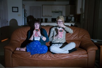
I knew I wanted my two subjects curled up on a couch, their faces twisted with fear as they struggled to shove popcorn down their gullets. I wanted a nice hard light, like that from a TV, that faded to black dramatically, leaving only the couch illuminated. This hard light would also create strong shadows from the existing objects in the room, adding to the fearful ambience. For consistency, I tried to use a flash in a softbox to simulate the TV, as it could be controlled much more accurately, but it just ended up illuminating the entire room, even with a fast shutter speed to eliminate as much ambient light from the room as possible. With flash failing to provide the results I wanted, I tried to actually light the scene with my TV.
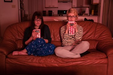
I had the DVR paused to a gum commercial that featured a lot of white to illuminate the scene but although it’s a modest (by today’s standards) 42 inches, it was still too large to provide the falloff I wanted. I found a Quaker Oats commercial that featured a lot of red and tried to use that to simulate a bloodbath on the TV, but I knew the red tint would not reproduce well on newsprint, so that was out.
At this point, I started to sweat because the troubleshooting was taking longer than I expected. On top of this, not only were my pictures poorly lit, they were blurry because I had to shoot six-second exposures to compensate for the darkness (these long exposures are why century-old portraits look so stiff — the subjects had to keep still for far longer than today and could not maintain dynamic poses). However, a quick check of my ISO revealed it was at 200, far too low for the darkness around me, but perfect for the flash picture I had thought I was going to make. I raised it to a moderate ISO of 640 and reduced my exposure times to one second, greatly increasing my sharpness.
With one problem out of the way, I focused on the problem of light, and that’s when I decided to use a headlamp to light the entire image. I had one around because the camera needed light for its focus system to work. I would shine the light briefly on my subjects so the camera could focus, lock that focus distance into the camera by switching to manual focus or using the AF-lock key, then make the exposure. However, using the headlamp itself as a light source and placing it at camera right, I saw the shadows I wanted. This immediate feedback is an undeniable advantage of using continuous light sources instead of flash. Simply move the light or change the intensity and you can see the effect right away, which saved me a lot of time.
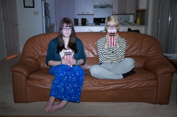
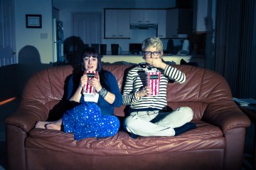
This image required a little more post-processing than usual. As it was a photo illustration, I had more leeway to edit, so I cooled down the colour temperature to make it moodier and raised the contrast significantly. Though I used Lightroom to make my colour adjustments, I used some old-fashioned techniques as well. When I noticed the digital clock on the kitchen stove (check the earlier photos), I just taped over it with black gaffer’s tape instead of waiting to retouch it away later, which was a time saver.
So, if you fancy the light from an old TV, but yours has been consigned to the dustbin of history (or better yet the recycling depot), know that a headlamp works well. More importantly, though, remember to avoid overly elaborate solutions to simple problems. It’s amazing what a small adjustment or a simple tool can do. I probably need to be reminded of this more than most.


