 Someone once told me that the best way to make life changes was to start simple and make specific, short-term goals that could be completed easily. It’s much the same in photography, but like all good advice, I tend not to take it right away. This was the case when it came to last week’s cover photo.
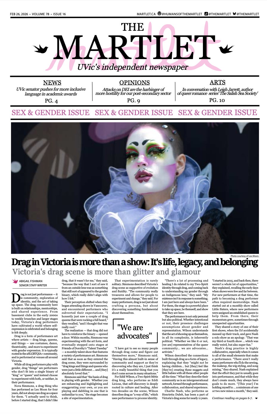
In the wake of Goldcorp’s donation to UVic’s Gustavson School of Business, the cover story would examine the company’s commitment to social responsibility in Honduras after the closing of a mine there. The reporter had actually traveled there and had taken photos herself, but while they depicted the scenery and the mine, the cover photo needed to be vertical, and many of the existing images would lose their impact if cropped, so it fell to me.
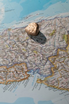
Early in the planning process, I knew I wanted to include some kind of gold nugget, a map of Honduras lying on an oak table and perhaps other explorer-type objects like a compass or some gold coins. At one point, I almost secured a real nugget, but when that did not materialize, I had to improvise. A last minute plea for help on Facebook got me a can of gold spray paint, which I used on a rock I found on a beach. Close enough.
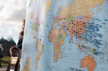
Students from Mount Douglas Secondary School hold up a map and encourage passerby to place a pin on the country where their clothes were made in a public awareness demonstration near the BC Parliament Buildings on January 15, 2012.
While still reeling from the fumes of the spray paint (I had forgotten to wear a respirator), I walked into the UVic library to borrow a map of Honduras. At this point, I was unsure of how large I wanted the map to be, though I knew I wanted a big one. I wanted to push a pin in it, but the library would probably have my head (or at least my wallet), so I didn’t. It would have been an easy way of marking the site of the mine, and the head of the pin could create a beautiful shadow if the light was placed properly, similar to a photo I took last year. After some deliberation, I got two maps of Honduras: a small colourful one acquired recently, and an older one that showed its age.
The following morning, I began to work. I usually start with the most complex ideas first since I’m most excited to try them out (not the best approach), but this time, I started with a simple approach because I had no idea where I really wanted to go with it. When I laid the two critical pieces down, the fake gold nugget and the map, I immediately wanted to use a hard light to literally “cast a shadow over Honduras”. It was a simple idea that could be executed fairly quickly, so I would have something to fall back on if my more complex photos failed. Of course, this early picture was the one that I ended up choosing, but at the time, I thought it would be my fallback photo.
After getting this first promising shot, I changed maps and really started making some keepers, or so I thought. One problem was immediately clear: the older map, while more wrinkly (and therefore immediately more interesting to me), was a similar colour to the gold nugget and did not provide adequate contrast. Then, instead of fixing the problem by changing the map, I began messing with the light, bouncing it off some nearby aluminum blinds to soften the shadow cast on the map (the bigger the light, the softer the shadows), but the softer light meant the texture of the rock was less apparent. I tried bouncing it off the ceiling, which was a terrible idea as the shadows disappeared entirely. That image had no depth or interest, it just turned my camera into a photocopier.
I started adding more small items to the photo, but it just made it more cluttered and diluted the meaning. Even the small photos of the actual Honduran landscape took away from the core idea of the photo: that the San Martin mine cast a shadow over the community. After the first few frames, I lost track of the thesis while trying to include too many ideas into one frame, and forgot to realize the importance of having a clear idea while leaving enough room for imagination. I stopped, tried to recreate the first image (and failed), so after an hour or so, I called it a day.
In retrospect, it was clear that I was not responding properly to this feedback loop of failure. Instead of addressing my problems as they came up one at a time, I changed other things, adding to my problems instead of solving them. So, slow down. Think critically about what the frame looks like, and address small problems with simple, direct solutions rather than making dramatic changes that might not even fix the problem you first had.
In terms of how I made it, I had a bare Yongnuo YN-560 III (a flash I got from eBay for about $80) mounted onto a boom arm on a light stand with a Rosco pale gold gel overtop of the flash to compliment the tonality of the stone. The boom in particular was critical as it granted me far more flexibility than if I just had the flash on top of the light stand. I could angle my light and place it anywhere I wanted without the stand getting in the way. If you have a light stand, you need at least one boom arm. Trust me.
I did not increase the size of my flash with any light modifiers because the small flash head was necessary to create that harsh shadow. By making the light source bigger, the texture of the rock and the sharpness of the shadow would disappear, taking the drama with it (as evidenced by trying to bounce the flash off the aluminum blinds). The concentrated light also kept the map slightly underexposed, emphasizing the rock and further saturating the colours on the map. I placed the rock about where I thought the San Martin mine was — about 90 km north of the capital city. Like the resulting photo, I hope it wasn’t too far off the mark.
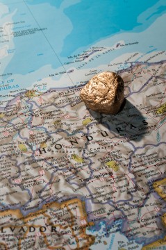
This is the print-optimized version of the image, and has a lot of contrast and sharpening added to counteract the effects of printing on grey-toned newsprint. The contrast is too high for web, but it’s one more thing I have to keep in mind when preparing images for print.
Read the story here.
Metadata: Nikon D300 w/35mm f/1.8 DX @ f/9, 1/50th sec, ISO 200.


