With a new mark, we explore the colours and coats that define the university
UVic unveiled a new logo collection, or “mark,” last month, signifying the start of a new design era for the university. We decided to dig deeper into the history of the UVic brand to understand where it all began. We also reached out to UVic for comment on the process of this latest design.
The coat of arms
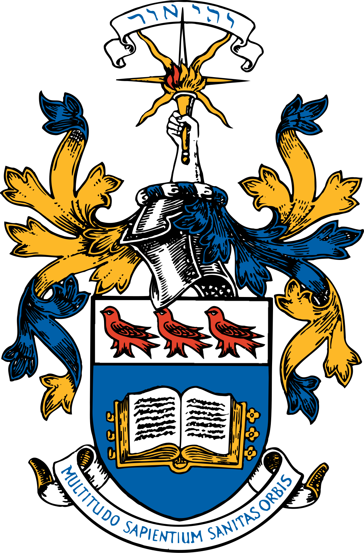
Photo via University of Victoria.
The university’s coat of arms pays homage to its days as Victoria College, which was originally affiliated with McGill University. That’s where the martlet birds come from, since they are prominent in McGill’s brand visuals even today.
The coat of arms is still used in formal settings, and features the colours blue, yellow, and red. It also contains UVic’s two official mottos — “Let there be light,” and “A multitude of the wise is the health of the world,” in Hebrew and Latin, respectively.
The crest and logo

Photo via University of Victoria.
UVic’s official logo has not changed in this recent update, or in the brand refresh before this one. This official image remains as the crest, with the words “University of Victoria” written below or beside it.
The crest still features the three martlet birds, but this time in a monochrome look of either blue, black, or white. It’s essentially a simplified version of the coat of arms that can be found all over campus.
The UVic Edge

Photo via University of Victoria.
The university’s biggest rebrand in recent history happened in 2015, with the reveal of the Edge. This is the visual that we’ve likely all seen on Brightspace, course outlines, and merchandise in the last few years.
When it was unveiled, the Edge was not meant to signal a change in logo. Instead, it intended to introduce a new idea of a “mark,” which a UVic spokesperson explained as “a visual way of showing our informal name.”
This mark featured the colours blue and yellow with a red wave accent, and has been in use for ten years as UVic’s standard visual. The university also used the concept of the Edge in marketing, as a word to describe UVic’s stand-out qualities.
The latest refresh

Photo via University of Victoria.
UVic recently revealed a new mark, which contains the colours green and yellow on the “V” of UVIC, where the Edge pattern once was.
A spokesperson explained that the “official” logo will remain as the crest, but UVic would like to move towards more widespread use of this new mark because of the colonial nature of crest-like symbols.
UVic also sees the removal of the colour red as distancing themselves from traditional institutional appearances. The website states that red is “associated with power and is overly common in the post-secondary landscape.”
The colours blue, green, and yellow are intended to represent the trees, ocean, and sun — elements that are central to campus life at UVic.
This brand refresh took four months, and was performed by the university’s communications and marketing team. A spokesperson noted that no extra financial resources were used for the creation of this new mark.
“The refreshed brand better reflects who we are, what we stand for and where we want to go,” they said.


