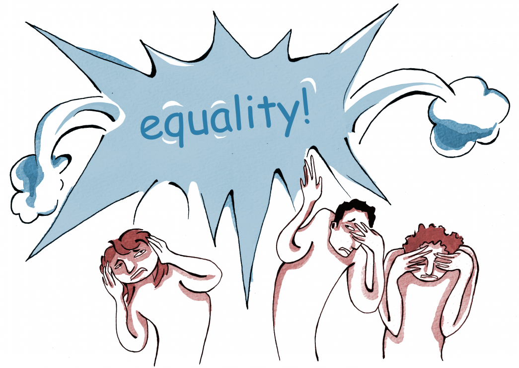
Last month, in solidarity with the protest of the killing of Eric Garner, several L.A. Lakers players wore shirts bearing Garner’s final words, “I can’t breathe.” Instantly, the players were denigrated by people online and in the media. The reason: the words were printed in Comic Sans, the much maligned typeface of people everywhere. Soon after, almost as many people came out against the naysayers for being inconsiderate, and while I think that criticizing the players’ gesture is in bad taste, it does point to a need for greater awareness. No matter the cause or intent, there is no escaping the Comic Sans effect. I am not defending the critics, but it would be more effective to avoid the fray altogether with a little awareness.
Vincent Connare, the man behind Comic Sans, famously said that “people who don’t like Comic Sans don’t know anything about design.” What Connare is referring to is the design industry, working with a brief, and creating something to a given specification. This glib remark is an oversimplification and sidesteps the real issue of Comic Sans: its cultural baggage.
The message should be taken seriously, but when people see those words all they see is Comic Sans. Even a worthy cause, with powerful words, is eaten away by the presence of Comic Sans, and the underlying message is missed.
The issue that most people have with Comic Sans is not its look or intended purpose, but its widespread erroneous use. Comic Sans is used in a wide range of contexts. The unfortunate uses of Comic Sans either do not accurately fit the overall style of a design or are oblivious to the Comic Sans effect. Comic Sans has become a default choice, a placeholder for anyone looking for a ‘handwritten’ typeface. It has become unavoidable, which might be what Microsoft hoped for their suite of fonts 20 years ago, but not what people want as the face of their social cause. The purpose of something handwritten is to convey personality and uniqueness, maybe a bit of informality, something slightly different than everyone else.
And yet, we can’t stop this conversation here; because, even where Comic Sans might be appropriate it will still be set upon by naysayers. Comic Sans has been around a while, and like the pervasive “Keep Calm” posters or countless applications of Helvetica, it had built up a lot of cultural baggage along the way. The very incidents that have raised the ire of Twitter and media is proof enough. There have been so many misuses of Comic Sans, misunderstood arguments, elitist remarks, and teasing jibes that any time someone brings it up the content of the message gets mired in debate.
Highlighting the content of the text is the purpose of a typeface; a message in Comic Sans is a message lost, made moot by the its appearance. Whenever I see Comic Sans I become upset. It pains me to see it, not because it looks ugly but because I can see the message dissolve right in front of me. There are so many typefaces better suited to the task. Comic Sans has achieved infamy and it is important that everyone makes the effort to choose a typeface that suits the needs of their message. There are many suitable alternatives: Primary Sans, Comfortaa, Komika, Daniel, and Cali Brush to name a few. In the end, the look of your words has just as much importance as the order you put them. Make sure they are seen.


