A misguided tour of UVic’s architecture via Google reviews

Graphic by Jon Miller.
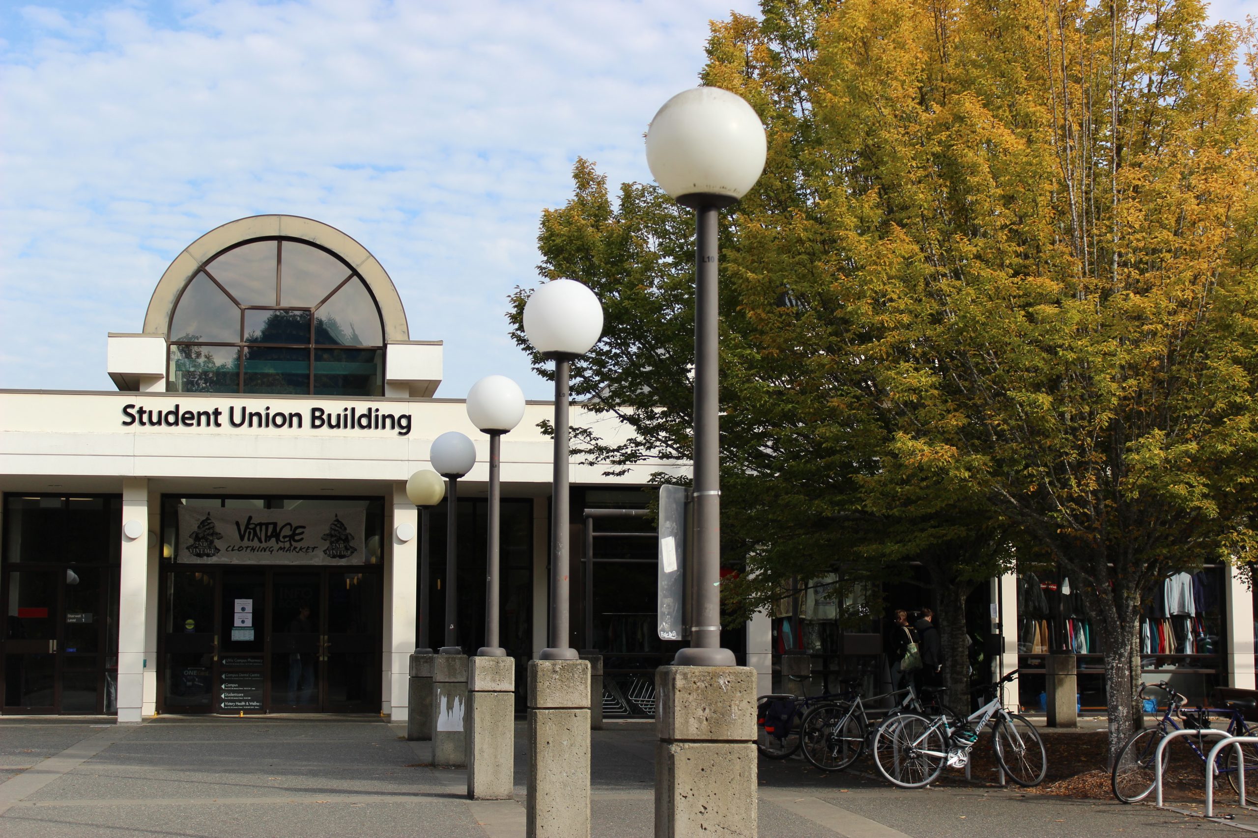
I’ve been a student at UVic for several years, and during that time, I have seldom stopped and thought, “Wow, the architecture on campus is stunning!” There’s nothing wrong with the buildings, per se, seeing as none (to my knowledge) have toppled. But there are only so many bland facades one person can take.
Maybe the concrete and brick are exposed to curb maintenance costs. Or perhaps a snide alumnus bequeathed the university a tanker of beige paint. Who knows? Either way, the dull exteriors gave me little desire to venture inside for a poke around. Then one day, I went online to locate a lecture hall and found Google reviews for some of UVic’s facilities. Now I was interested.
“Vending machines don’t have good snacks,” one critic of the David Strong Building wrote. It’s a fair complaint but lacks context. Is it that vending machines generally don’t have good snacks? Or are we implying that these, in particular, lack a certain je ne sais quoi?
If I designed an academic space, it would have doors so slim and halls so narrow that even students and faculty could barely squeeze inside. Then, there wouldn’t be room for any post-construction accoutrements. And thus, I couldn’t be rebuked for something beyond my control — like a fountain that spits water into your bottle one teaspoon at a time.
Over at the Bob Wright Centre, a student posted, “Failed an exam or two here in my undergrad and passed a few more.” They gave the building four stars along with a “Whale/5.” A couple of questions: 1. Could a flawless review have been in the cards had this person studied more? 2. Why doesn’t a rating of “whale” equal a perfect score? Aren’t they the lengthiest creatures in the sea?
Remarkably, I learned that the lion’s mane jellyfish tops the charts at 36.6 metres, with the blue whale tailing close behind. To any professors who may have flunked this pupil on a marine biology quiz, consider amending their grades because they certainly know their stuff.
“Seeing as this is the building I work out of I’m only giving it 2 stars,” one poster quipped about Clearihue. “Could use a Taco Bell and a water slide.” The cost of opening such a franchise is more than $1 million. Granted, it’s not cheap. But if UVic is keen on raising Clearihue’s status beyond the 4.1 stars it presently holds, a fast-food kiosk may be an easy fix.
Regarding the waterslide, prices will depend on whether it’s for personal or commercial use. If you’re looking for something discreet to place beside a kiddie pool in the staff lunchroom, there’s likely one at Walmart for $100 or so.
According to Aqua, “The business magazine for spa and pool professionals,” a more substantial chute — something that can whisk you from the rooftop and fling you into Petch Fountain — will be in the ballpark of $100 000. And don’t forget insurance fees plus the hassle of dismantling the thing when winter arrives. I suggest we abandon this plan and move on.
I’m not entirely sure what’s happening inside the Human and Social Development Building, but there are some gripes about legroom or lack thereof.
“As a 6 foot dude I give this one a solid aching knees/5,” someone remarked. (FYI, a pair of “aching knees” equals two stars — one for each limb, I presume.) As I’m 5’8” and can slip into almost anything, I sympathize with those who, by virtue of being above-average height, don’t fit society’s mould. That said, it’s nice to know there are at least some drawbacks to being tall.
“Terrible desk size (481cm squared),” another person reported. I don’t know the standard area of a university classroom work surface off the top of my head, so I can’t say if the measurement this person provided is above or below the national average. (Sorry. I don’t know what to tell you.) But in Subway terms, 481 cm² is roughly a footlong Veggie Delight wide and a six-inch Cold Cut Combo deep. That’s not a lot of space. But then again, we’re supposed to take notes during class, not comb through our lunch kits for a mid-lecture morsel of food — at least that’s what I recall a professor saying once.
With the mention of grub, we segue into our last and perhaps most contentious building: The Cove.
“Whoever makes the buffalo chicken wrap needs to be fired,” one reviewer wrote. It’s hard to find humour in job loss. However, I would likely laugh at myself if I were so inept at wrapping a tortilla around a handful of fixings that letting me go was my employer’s only option.
“On multiple occasions I’ve gotten bones in my chicken strips,” someone else said. Well, what kind of bones are we talking about? Does this require a phone call to the poultry manufacturing plant? Or should we get forensics involved?
“Got chicken, it was tofu,” another patron pointed out. Maybe this person grabbed the wrong product by mistake. Or perhaps the cooks Trojan-horsed a piece of faux meat inside a deep-fried crust. Who’s to say? If it’s the latter, the ploy may have been part of that Meatless Monday debacle. UVic recently suspended the program. So, everybody, relax.
I read the remaining commentary and closed my laptop. I still had questions, like whether any buildings have unique interior design features — crown mouldings, marble floors, things like that. Instead, I saw a range of reviews, mostly about people’s experiences inside these facilities; there wasn’t much focus on the architecture.
But my time online wasn’t a complete waste. The witty remarks were entertaining to read, and I was fascinated by the various affronts that elicit public complaints these days. The five-star rating scale, however, left me wary since, at first glance, the results can be misleading. So, I’ve decided to ditch the internet and will form my opinion by touring UVic’s campus in person.


